 ChatGPT
 Claude
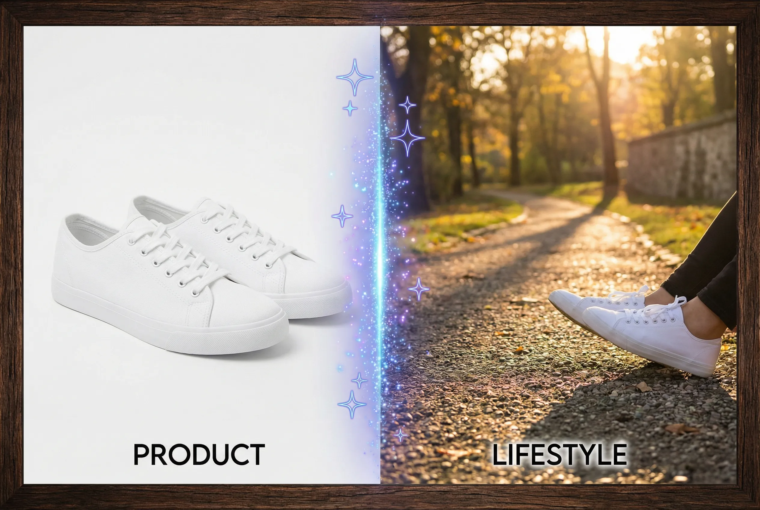
A photo interpreted as a sticker or cartoon needs fewer details to work inside a message. At emoji size, small lines and fine texture collapse into the same few pixels. Decide which expression or accessory carries the idea before drawing or generating the rest of the image.
Test the sticker at two sizes
For a cartoon of a smiling person with round glasses, check a 32-pixel and a 64-pixel preview. The eyes, glasses and smile should still be distinguishable when they appear among normal text. If the original uses detailed hair or a patterned shirt, reduce those details in your style brief and keep the main cue obvious. A one-color background or clean outer silhouette helps prevent visual competition.
Design for real messaging surfaces
Put the sticker on a light and dark panel. If a pale outline vanishes on light while the shaded interior disappears on dark, strengthen the silhouette or shift the overall contrast. Some messaging tools crop items automatically, so leave breathing room around raised hands or a hat. Use an ordinary image asset for a custom chat sticker and check the upload rules for the destination separately.
Choose the simplest readable version
Try the chibi maker for a consented image and ask for one clear expression. Compare versions at intended size before spending time on small details. A good sticker remains recognizable without a caption. When the viewer can't distinguish the eyes and mouth, try a calmer pose or a tighter crop that gives those shapes more of the available pixels.
Look at the sticker beside at least one other real emoji or chat icon. Familiar neighboring graphics can make a cluttered design more obvious.