 ChatGPT
 Claude
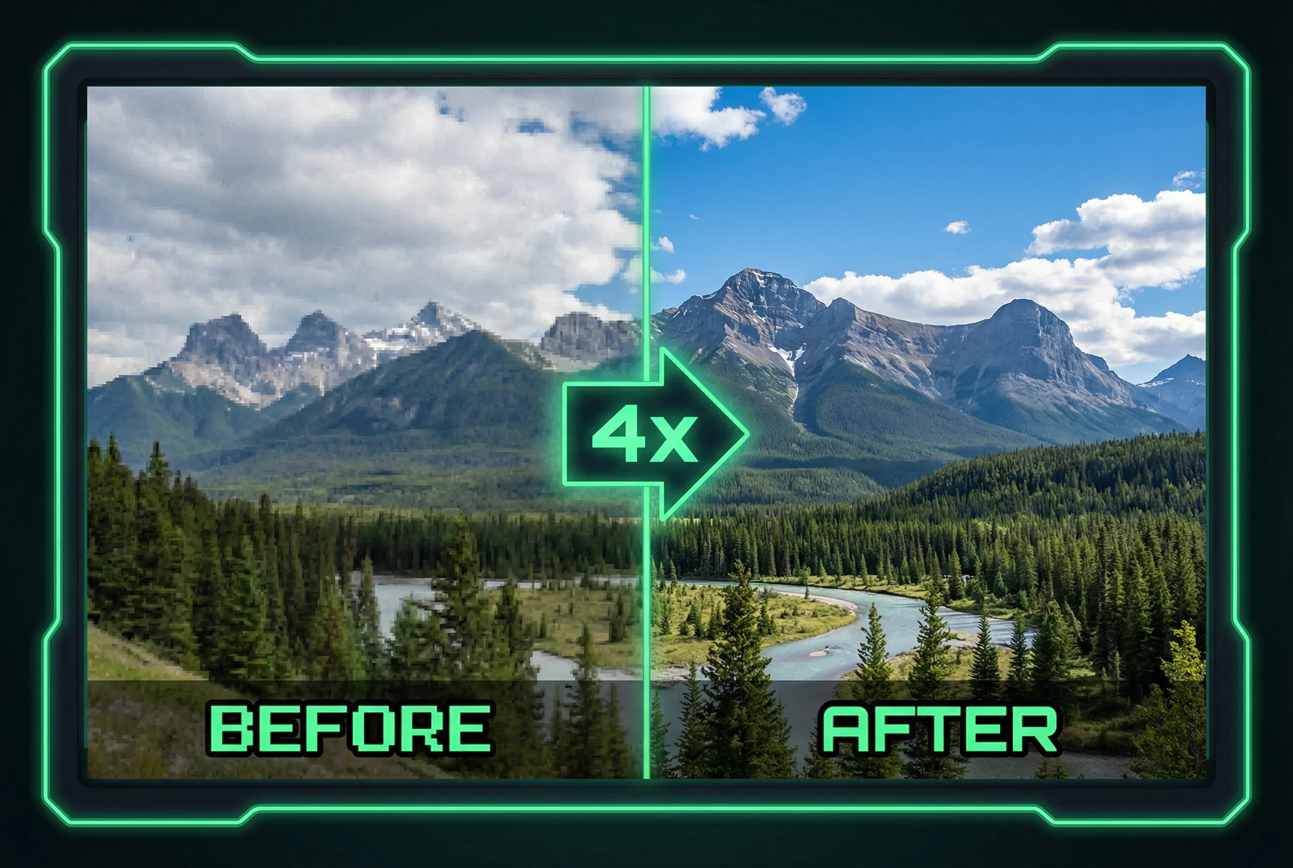
Black line art often looks sharp before enlargement because its silhouettes and corners carry the drawing. An aggressive upscaler may thicken strokes, round tiny details, or smooth deliberate joins. Choose a verification crop before processing the whole illustration so you can compare changes in line weight and geometry without relying on the enlarged preview.
Pick the lines that carry the drawing
Take an ink drawing of a house. Save one crop around a roof peak, one around crosshatching, and one around a long pen stroke with a slight taper. The roof tests straight-line geometry. Crosshatching reveals whether separate strokes merge when there are only a few pixels between them. The tapered stroke helps you check if the tool thickened thin lines, which would make light areas read darker in the finished illustration.
Compare on the same canvas
Place the source enlarged conventionally and the generated candidate on two copies of the same artboard. Keep their scale and positions comparable. At small size a smoothed outline can appear cleaner, so also inspect the zoom level used by your print or digital output. If consistency matters more than newly generated detail, follow the original contour in a vector editor or accept the less aggressive upscale.
Accept the original drawing's character
Use the AI image upscaler to make a candidate at the smallest scale you need. Check tip angles, line thickness, and whether fine hatches still leave a paper gap. Where a corner has rounded, restore from the source or use a clean redraw for that region. A good output lets viewers recognize the original pen pressure, silhouette, and spacing rather than imposing a thicker, uniform outline.