

 ChatGPT
 Claude
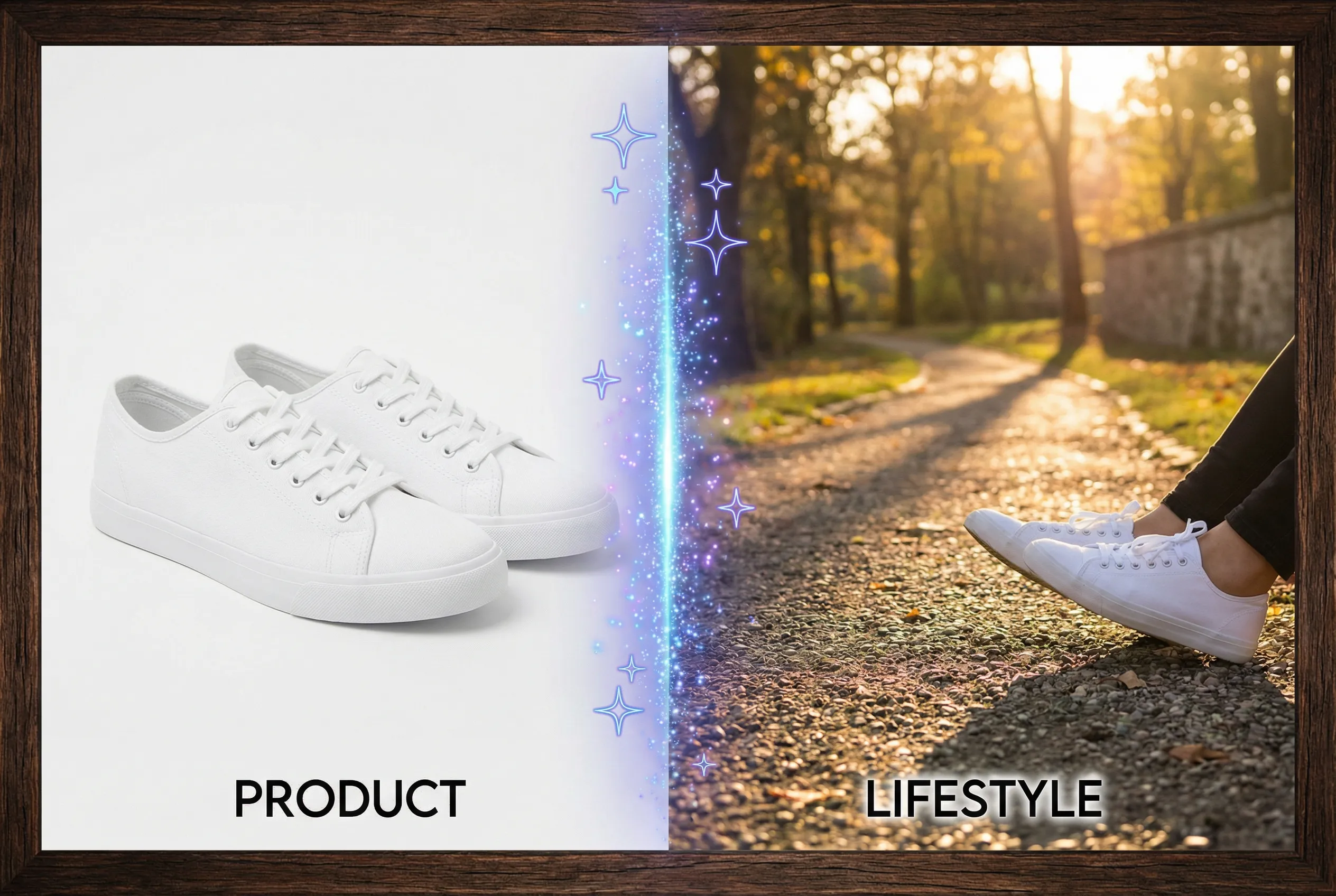
A product photo may look warm because the real object is warm or because the lighting casts color across the whole scene. A neutral reference helps separate the two. Use it when setting up the source photos and review the final edit against an approved original before judging brand color.
Prepare a comparison surface
Imagine a white ceramic cup photographed beside unprinted neutral gray card stock. Place both under the same light, with the gray card outside the main composition. The card can help you notice a general cast caused by daylight, mixed bulbs or a tinted reflector. If the card is not actually neutral, treat it as a relative consistency check. An approved color reference is necessary when color matching stakes are high.
Review localized and global changes
Compare the cup body, its shadow and an untouched background area after any AI edit. If all three shift in the same direction, the edit probably changed the overall color balance. If only one region changes, inspect whether that effect plausibly comes from the modified light. A white object can naturally retain subtle tint in a reflection. Keep that nuance separate from a cast that makes the product itself appear different.
Use the real product as the final authority
Try the product photography tool with a lighting request that suits the source and a clear product reference. Check the accepted result in the catalog beside other items. If a neutral object picks up a strong hue that the actual product never shows, revise the treatment or ship the original. Record your chosen neutral comparison method so a later variant can be reviewed consistently.

