

 ChatGPT
 Claude
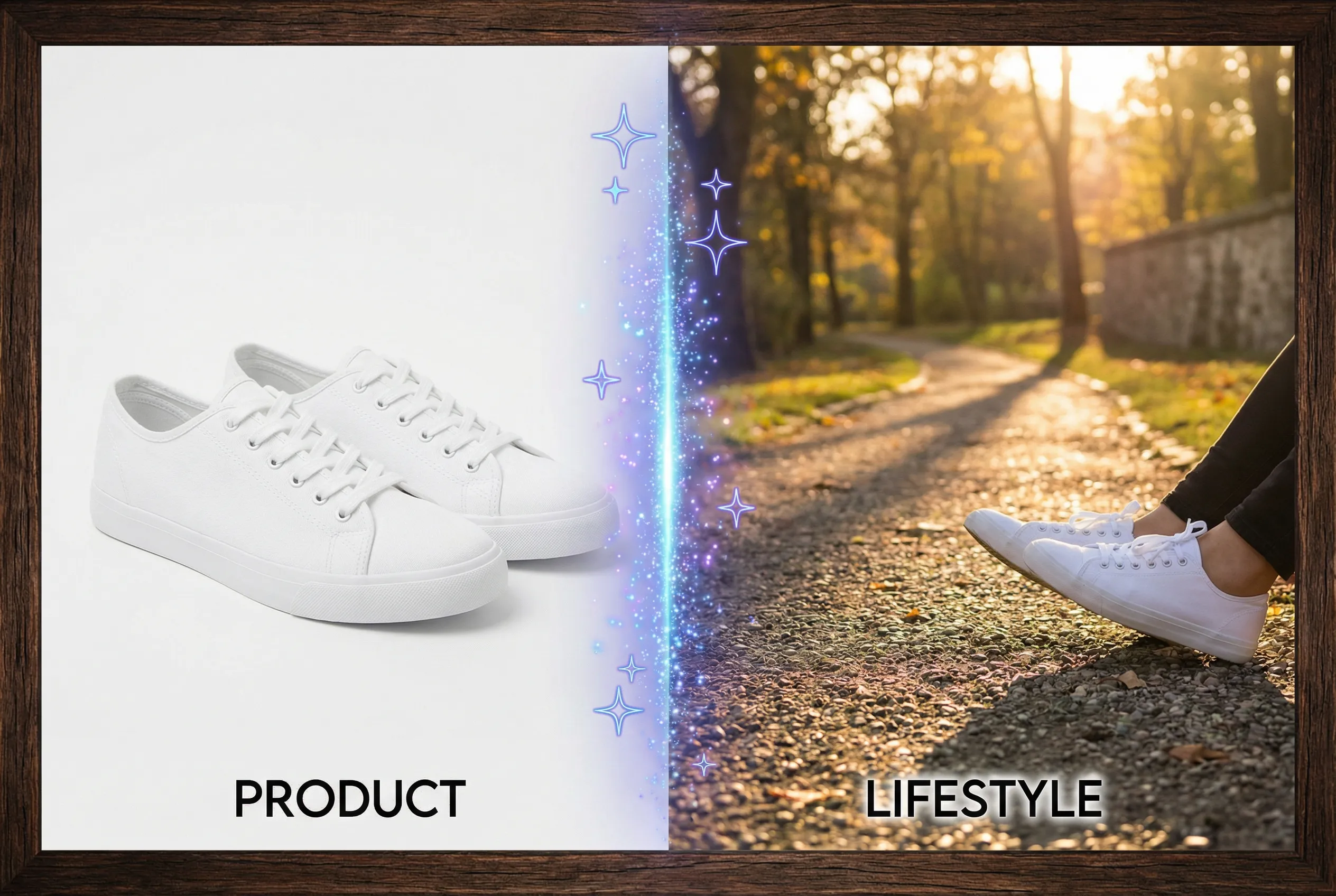
AI-assisted product photos can keep a catalog visually consistent while shifting the apparent color of a product. Compare colorways together using known references. A variant that looks good by itself can cause shoppers to mistake it for a different finish when it is placed next to the rest of the collection.
Photograph or label the source variants
For a backpack line with navy, charcoal, and olive versions, use a source image for each actual colorway if possible. Keep background and light consistent across the original set. Save representative crops of the largest fabric areas and note whether the product is matte or reflective. Color can look different in shadows, so identify a trustworthy midtone before judging any output.
Compare the catalog in one view
Place the edited candidates beside the corresponding originals on the same neutral background. At catalog size, evaluate whether navy still reads as distinguishable from charcoal and whether olive looks like the correct undertone. Compare a zipper and logo as secondary cues for how much else the image changed. Where possible, check on a color-managed display or a known device rather than a screen showing an adaptive warm tone.
Set a firm product boundary
Use the product photography tool to create a matching visual treatment from those references. If a variant shifts enough to resemble another SKU, reject it and bring the treatment closer to the original. Keep the physical product or approved art as the source of truth. A consistent series still needs to show differences that are meaningful for the decision a shopper makes.

