
 ChatGPT
 Claude
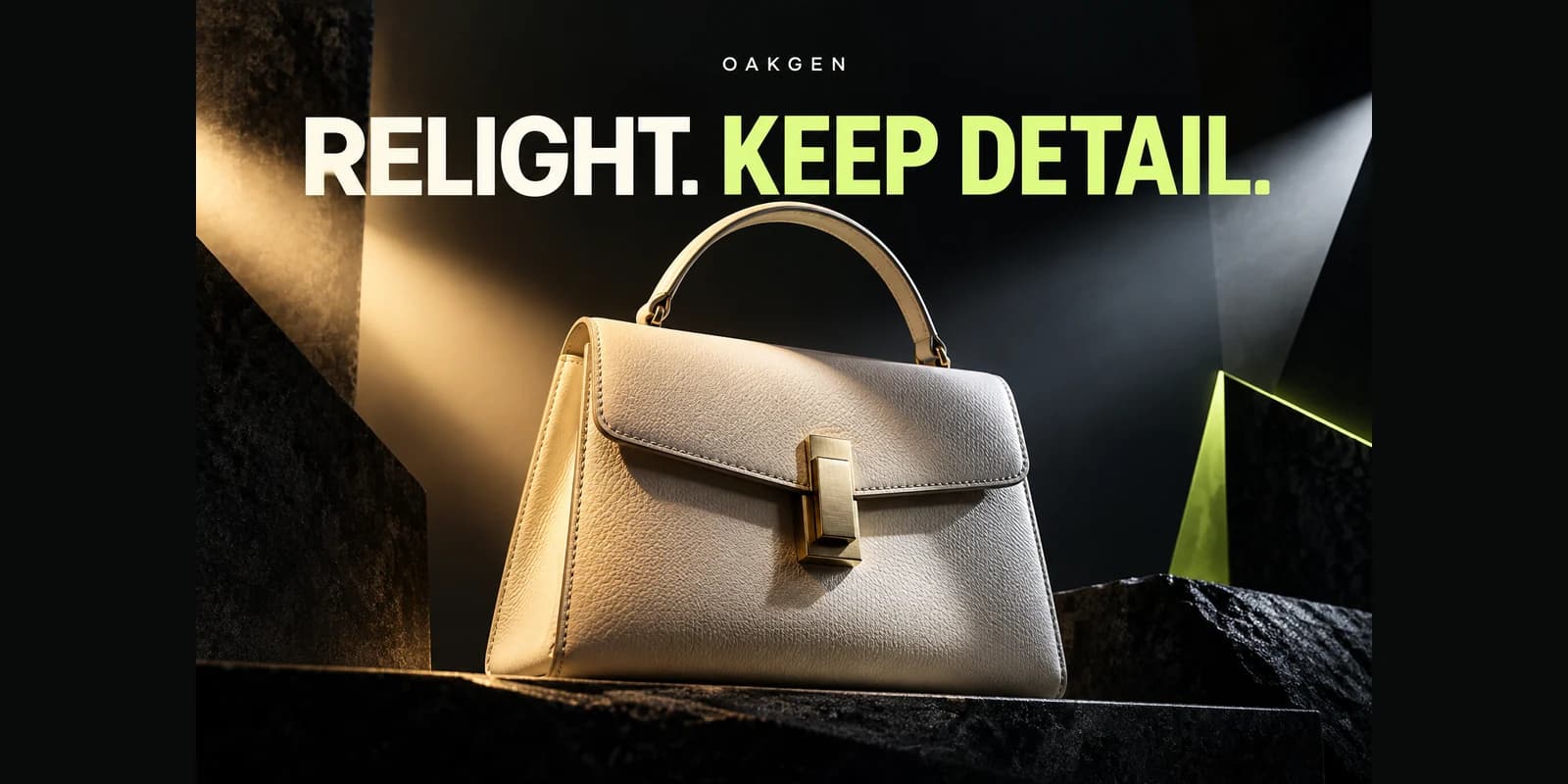
A model can render an image that broadly matches a brand palette while missing the exact color needed for a logo or swatch. Treat brand-color approval as a check against verified artwork. Use generated imagery for the scene and set exact graphic elements in the design file where they can be controlled.
Choose the reference patch
Imagine a poster with a muted purple product and a lime brand accent. Save the approved color values outside the image and mark which visible areas must match them. Keep separate the exact artwork and surrounding cushions, reflections, or lighting that can vary. If the product itself needs a specific color, use a true photograph or known reference as the authority.
Compare in the final color context
Place the edited image beside the approved swatches in a single design file. A color can look different next to another bright shade. Check the same areas with a sampled color value where exactness matters and view the full composition at the intended size. Avoid guessing from differently calibrated or automatically tinted screens. Add the logo and any required brand color elements as separate layers if the model keeps shifting them.
Approve the role, not just the hue
Try the AI image generator for an image that has the right visual direction without requiring pixels to match a specific code. Keep approved assets available in the working file. A pass means exact graphic colors are specified intentionally and the photographed or generated surroundings feel consistent with the brand rather than introducing a competing palette.
For a printed campaign, ask the print provider to proof the exact graphic colors before evaluating how the generated photo looks nearby.